
Filter by
The language used throughout the course, in both instruction and assessments.
181 results for "excel charts"

Google Cloud
Skills you'll gain: Cloud Applications, Data Management, Spreadsheet Software, Business Analysis, Cloud Computing, Data Analysis, Leadership and Management, Collaboration, Data Visualization, Databases, Problem Solving
The Hong Kong University of Science and Technology
Skills you'll gain: Computer Graphics, Computer Programming, Graphics Software, Computer Programming Tools, Microsoft Excel, System Software, Data Analysis Software, Software As A Service, Spreadsheet Software, Computer Graphic Techniques

SkillUp EdTech
Skills you'll gain: Microsoft Excel
Coursera Project Network
Skills you'll gain: Finance, Microsoft Excel
Coursera Project Network
Skills you'll gain: Microsoft Excel

Coursera Project Network
Skills you'll gain: Data Analysis, Microsoft Excel

Coursera Project Network
Skills you'll gain: Microsoft Excel

Microsoft
Skills you'll gain: Data Analysis, Data Visualization, Power BI, Storytelling

Skills you'll gain: Data Visualization, Plot (Graphics), Microsoft Excel, Statistical Visualization, Business Analysis, Data Analysis, Data Visualization Software, Interactive Data Visualization, Spreadsheet Software
 Status: Free
Coursera Instructor Network

University of Colorado System
Skills you'll gain: Business Transformation, Change Management, Leadership Development, Leadership and Management, Organizational Development, Project Management, Strategy, Strategy and Operations, Business Communication, Professional Development
Microsoft
Skills you'll gain: Critical Thinking, Data Analysis, Data Visualization, Microsoft Excel, Spreadsheet Software, Accounting, Basic Descriptive Statistics, Data Analysis Software, Data Model, General Accounting, Leadership and Management
In summary, here are 10 of our most popular excel charts courses
- Google Sheets: Google Cloud
- Introduction to Computers and Office Productivity Software: The Hong Kong University of Science and Technology
- Get Started with Spreadsheet Applications: Excel: SkillUp EdTech
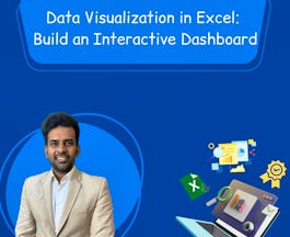
- Data Visualization in Excel: Build an Interactive Dashboard: Coursera Project Network
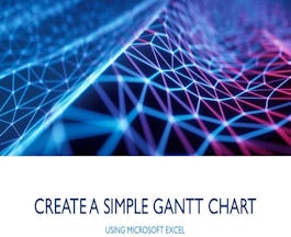
- Create a Simple Gantt Chart using Microsoft Excel: Coursera Project Network
- Conditional Formatting, Tables and Charts in Microsoft Excel: Coursera Project Network
- Building Candlestick Charts with Microsoft Excel: Coursera Project Network
- Creative Designing in Power BI: Microsoft
- Data Visualization and Dashboards with Excel and Cognos: IBM
- Data Ingestion, Exploration & Visualization in Qlik Sense: Coursera Instructor Network


